Introduction
AnalyCHART - The simplest charting tool.
Charts are a visual way to display data and gain insights from it. When we need to analyze data changes and understand data trends, charts are often used.
AnalyCHART uses a simple and easy-to-understand interactive format to create dynamic charts without any code, and it provides a large number of reusable examples. You can directly understand your data through charts on our website, or download the charts for use elsewhere.
Features
Supports Multiple Data Input Methods
Data sources can come from local uploads, network URLs, direct text input, and image recognition.
Simple and Intuitive UI Interaction, No Programming Knowledge Required
Unlike other tools that draw charts through scripts, AnalyCHART controls chart generation via UI options and features a very simple UI design that is intuitive and easy to understand.
Efficient Data Processing with AI
Use a chat-based approach to provide your needs and instructions, allowing AI to process the data — no need for coding or searching through numerous formula options.
Two charting Modes and a Wealth of Templates
It supports both basic and advanced modes. For most cases, using the basic mode combined with built-in templates is sufficient to create satisfactory charts.
Dynamic Rendering
Any change in options will instantly render the results, allowing you to see the outcome with zero delay.
Rich Examples
If you're unsure about which chart style to choose, you can refer to the chart styles in the examples. Alternatively, if you don't want to spend time learning the UI options, you can directly use them, replace the data, and generate charts without any configuration.
Getting Started
First, you need to prepare your data.
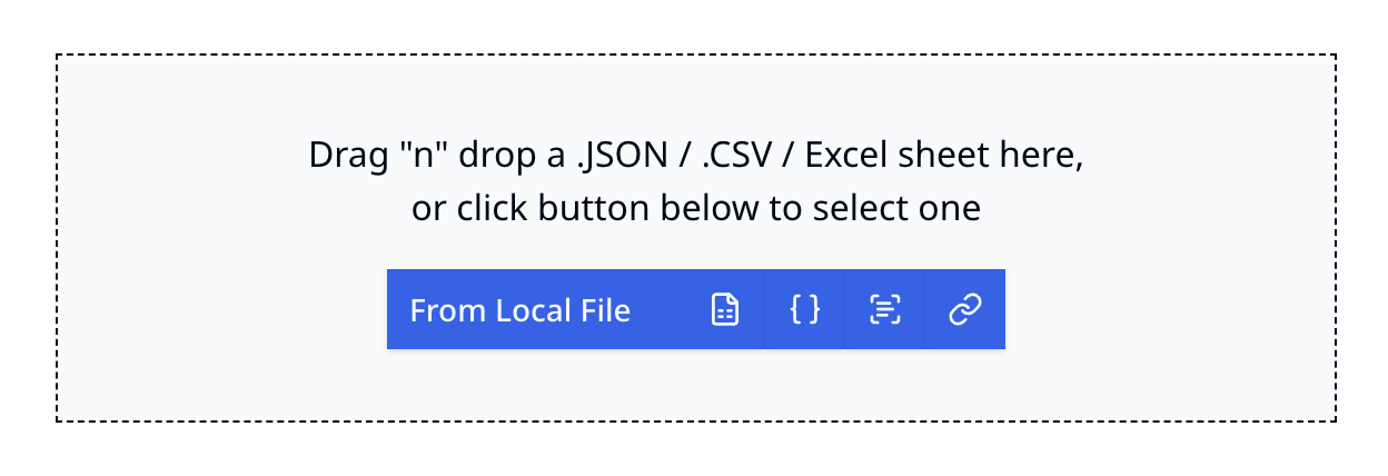
AnalyCHART supports data sources from JSON/CSV/Excel files, either from local storage or a web URL, or you can directly input data into a text box, even image recognition.
Upload or input your data using the component box below:
For example, we upload a JSON file with the following content:
[
  { "month": "January", "desktop": 186, "mobile": 80 },
  { "month": "February", "desktop": 305, "mobile": 200 },
  { "month": "March", "desktop": 237, "mobile": 120 },
  { "month": "April", "desktop": 73, "mobile": 190 },
  { "month": "May", "desktop": 209, "mobile": 130 },
  { "month": "June", "desktop": 214, "mobile": 140 }
]
After data input, you will enter the data processing page. On the left is the data preview, and on the right is the AI chatbox for entering instructions to process the data.
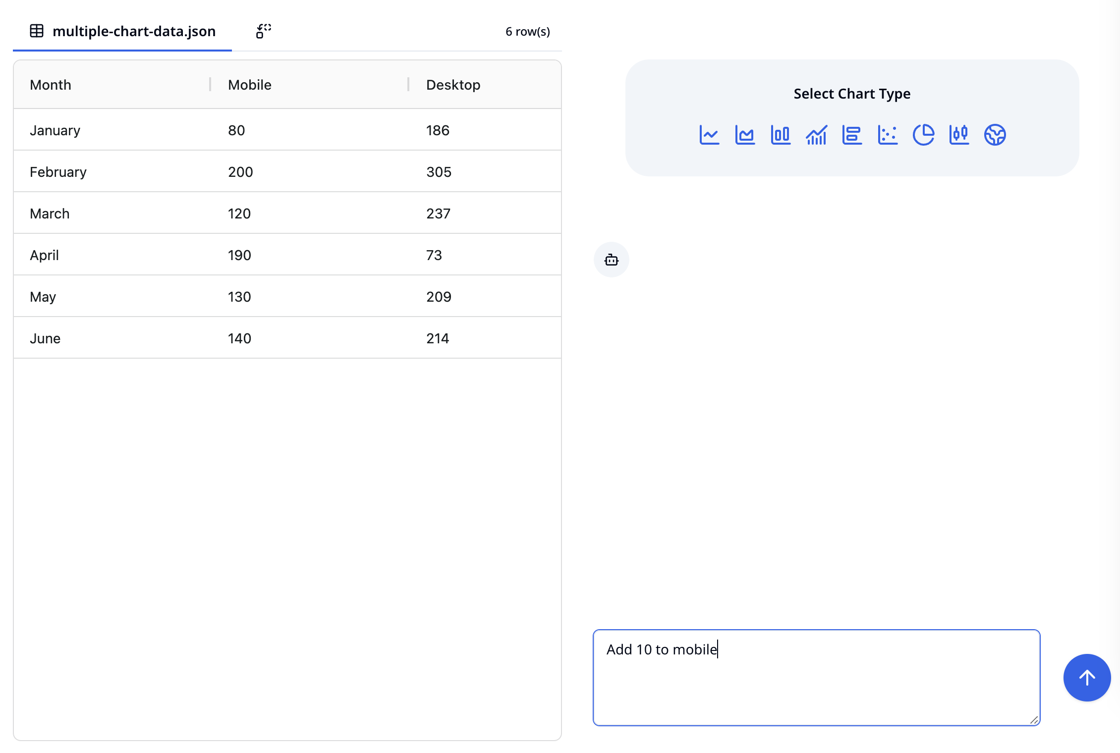
Now, you can start creating charts. Above the chatbox on the right, select the chart style you want to draw.
AnalyCHART supports a wide range of chart styles, including line chart, area chart, bar chart, horizontal bar chart, scatter chart, pie chart, candlestick chart, map, and more, with additional styles being added. Each style is controlled by a set of similar options. You can create different charts using a consistent operation method.
There are two modes for creating charts: basic and advanced. After selecting a chart style, the default setting is basic mode.
Below, we'll use a line chart as an example to guide you through the process.
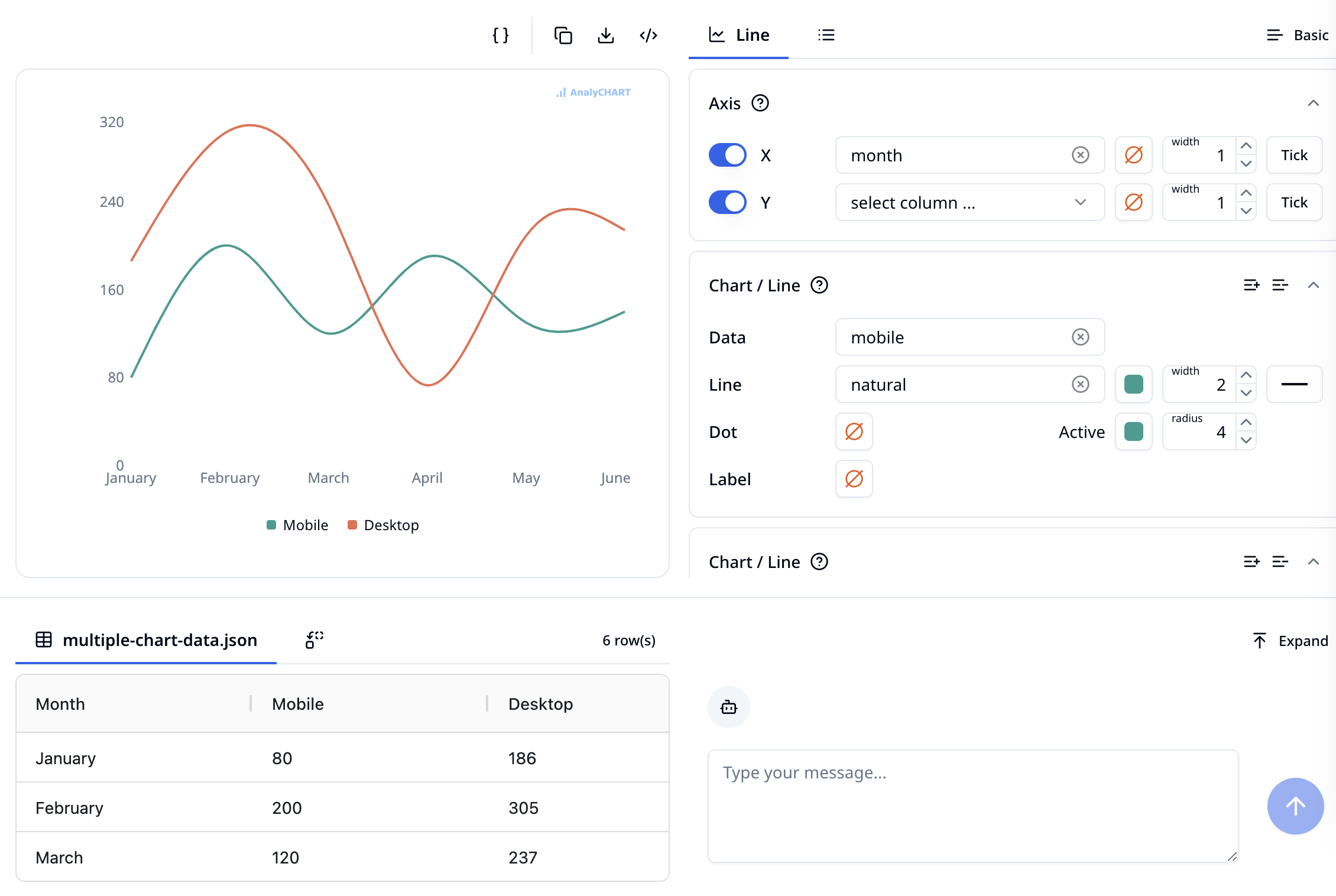
Basic Mode
In basic mode, you can quickly complete the chart creation process by selecting fixed style options from templates.
After selecting the line chart style, the interface looks like this:
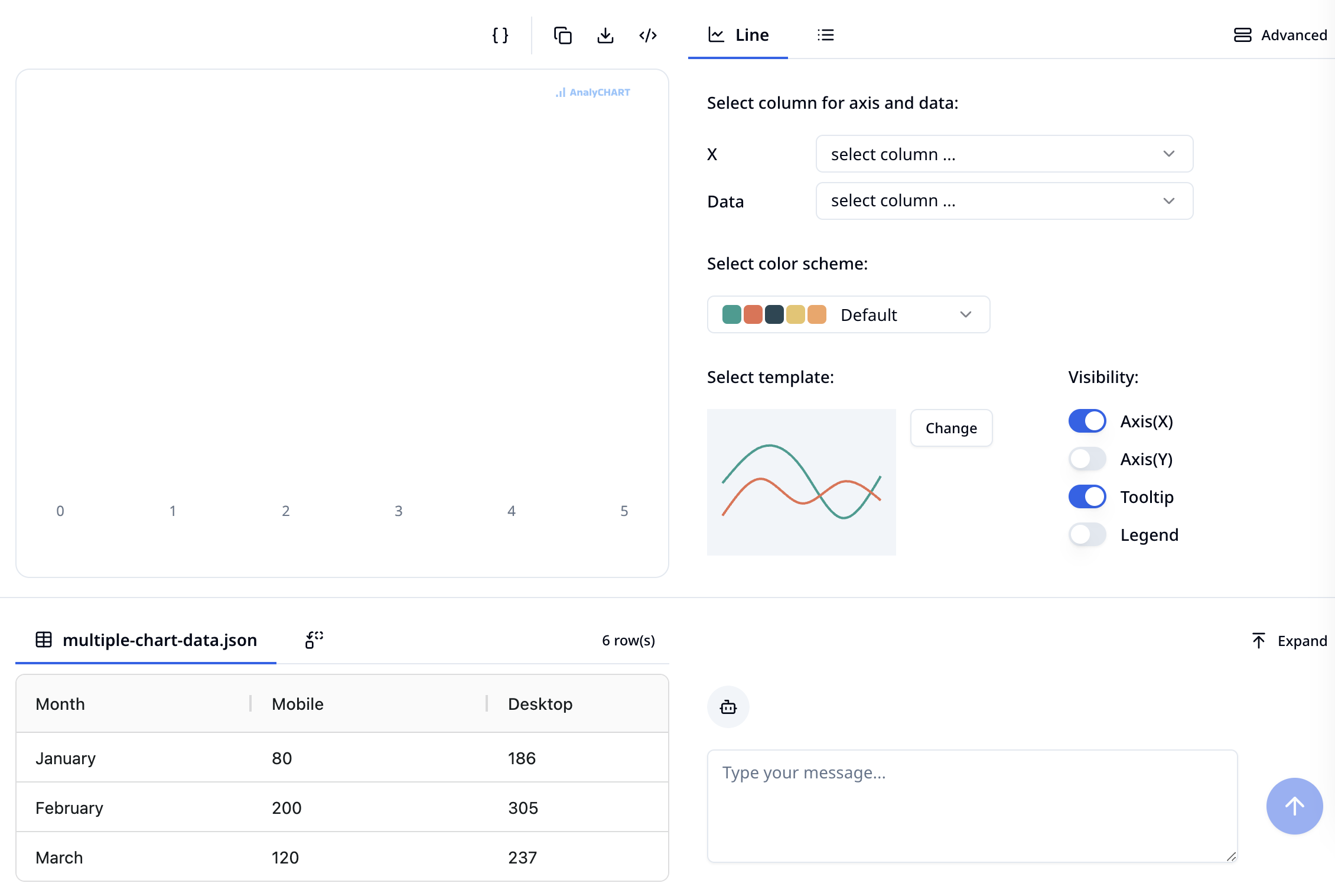
The chart creation process is divided into 4 steps:
- Select the axes and data columns
- Select a color scheme
- Select the chart's style from templates
- Select the visibility of additional information
Once you've made your selections, you can see the rendered result on the right:
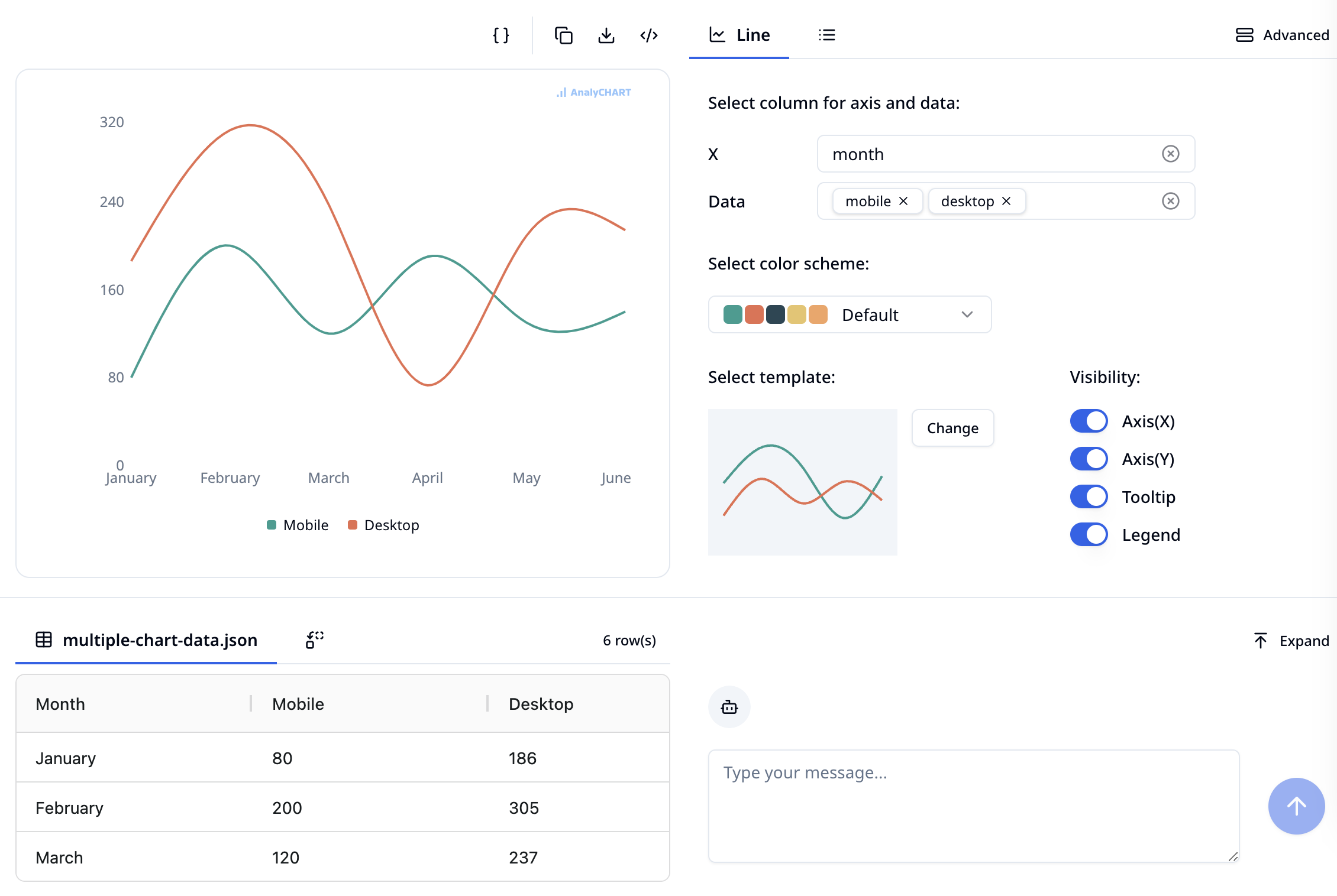
It's that simple! Now you can click the "Download" button to download your chart.
Note: If you need to modify the data while creating the chart, you can do so in the data area below. You can also click the "Expand" button in the upper right corner to enlarge the view.
Advanced Mode
For typical data visualization needs, the basic mode is usually sufficient. However, if you require more detailed adjustments to the style that cannot be achieved through color schemes and templates, you can switch to the advanced mode.
Click on the "More Options" button below, or switch using the "Advanced" button at the top.
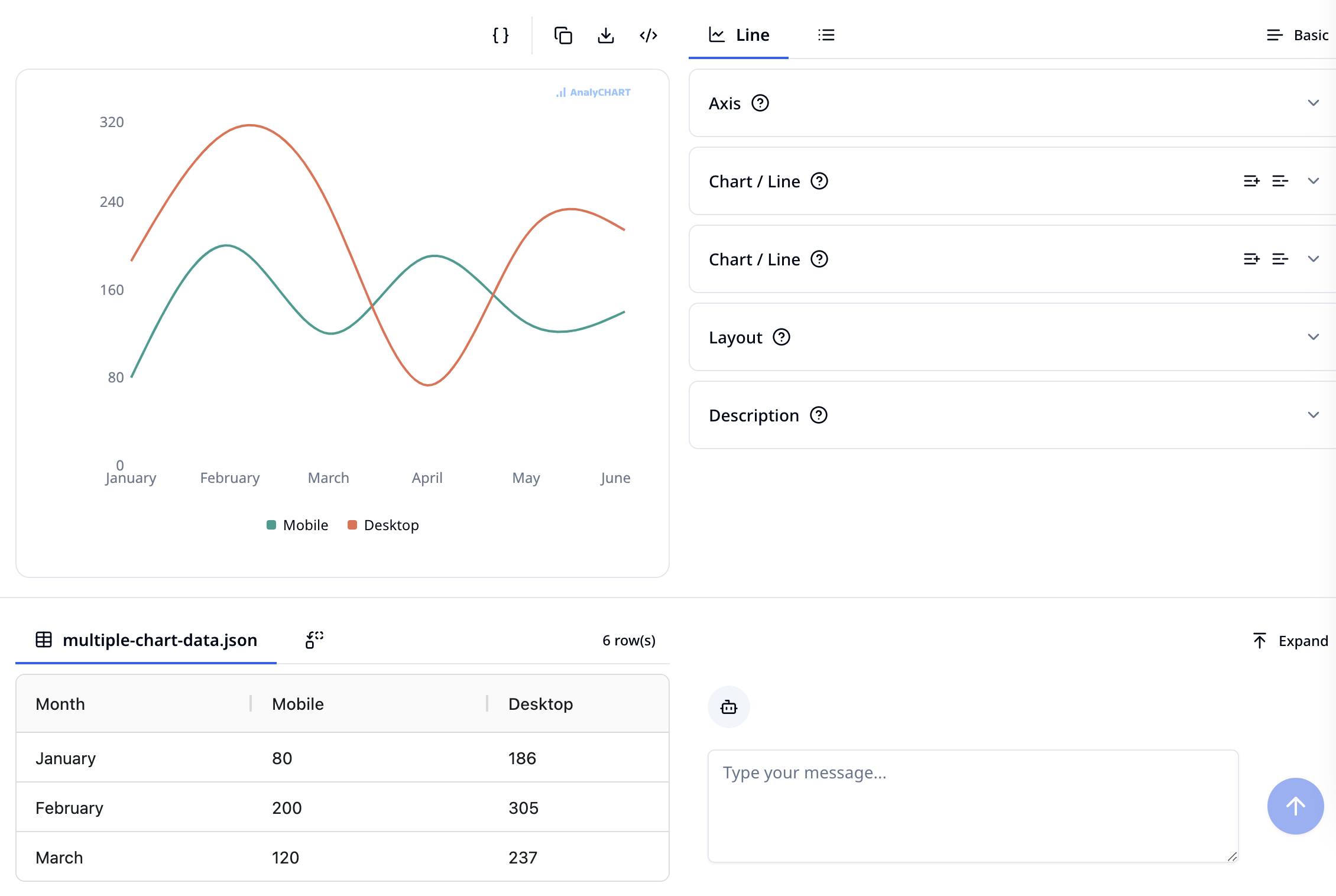
In advanced mode, chart drawing is controlled through an options panel like the one below:
You can collapse the options panel. For line charts, there are several option panels for axis, line layers, layout, and descriptive information. Through these panels, you can adjust the axis line styles, various line styles, the margins and grid of the entire chart, the chart title and description, tooltips, legends, and other elements.
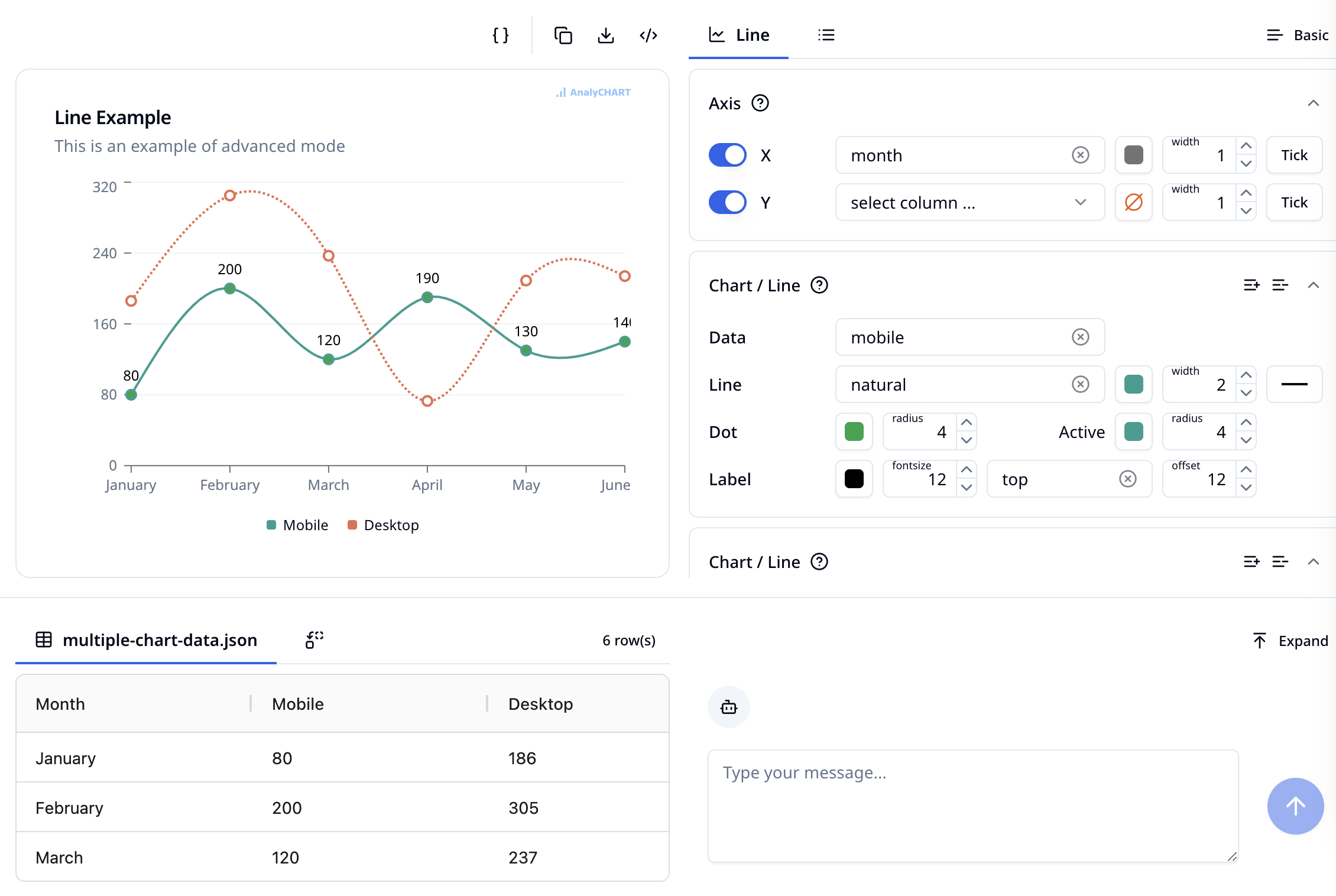
For example, we can adjust it to the following effect.
Example
AnalyCHART provides typical examples for each chart style, where you can find charts similar to the effect you’re aiming for. Click "Try" to explore the configuration options for these charts. You can also directly replace the data on the opened page to draw the chart.
For example, the "Line Chart - Label" sample:
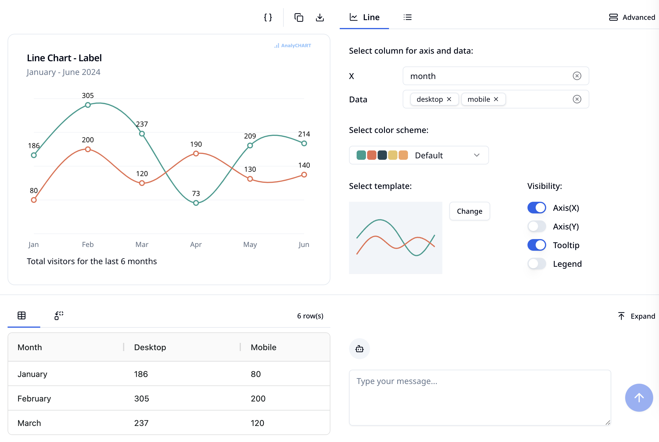
You can adjust some options based on this to achieve the desired effect. Note that some styles in the example use options from advanced mode, so you may need to switch to advanced mode to explore its configuration.
Next Steps
Please refer to other documentation to learn about the usage and options of various chart styles.