Combined Chart
Configurable options for the combined chart.
When a chart requires multiple styles to plot different data series, a combined chart can be used. It allows you to combine any of the three styles — line, area, and bar — within the same chart.
Basic Mode
In basic mode, to create a combined chart, the following are required:
- X-axis and Data: Select columns using the dropdown menu. These are mandatory. Unlike the previous chart types, when selecting data columns, you must also specify the chart style, which defaults to line.
- Color Scheme: select a color scheme from the dropdown. The default is the "Default" color scheme.
- Template: select a template using the "Change" button. If not selected, the default template is used.
- Visibility: specify whether the X-axis, Y-axis, tooltip, and legend are visible. By default, the X-axis and tooltip triggered by the cursor are displayed.
Advanced Mode
In advanced mode, more option values can be adjusted.
Axis
This includes both X and Y axes.
- Corresponding Column (X, Y): select columns from the data using the dropdown. X is required, and Y is optional. If no Y column is selected, the chart will automatically adjust.
- Visibility: controlled via the toggle button above.
- Line Color: the default is , indicating that the axis line is not displayed. You can click to select a color from the color palette or enter a HEX value to specify your preferred color. indicates using the default color.
- Line Width: specifies the thickness of the axis line.
Ticks and labels:
- Label: configure the color, font weight, and rotation angle of the labels.
- Format: use formulas to process the label text.
- Line: by default, it is not displayed. When enabled, you can configure the thickness and length of the ticks.
- Layout: configure the minimum distance between ticks and the spacing between ticks and labels.
- Numeric: when the axis column corresponds to numeric data, you can specify the number of ticks.
- Inside: controls whether the ticks and labels are displayed inside or outside the axis.
Chart
Other chart types have a default style panel for that specific chart type, but the combined chart does not, and it needs to be added manually.
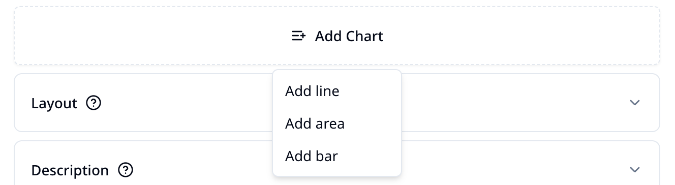
You can also add or remove chart styles by using the and buttons at the top right corner of the panel.
For the configuration options of the three chart styles in the combined chart, please refer to:
Layout
Includes:
- Margin: configure the top, bottom, left, and right margins of the drawing area (including the axis).
- Grid: configure whether the horizontal and vertical gridlines are displayed.
Description
Used to configure the display of supplementary information for the chart.
- Title: configure the title of the chart, located at the top of the chart.
- Description: configure the description of the chart, located below the title.
- Footer: configure the footer text of the chart, located at the bottom of the chart.
- Tooltip: configure whether to display the tooltip, its offset, and whether the cursor line is shown.
- Legend: configure whether to display the legend, its position on the chart. By default, it is positioned at the bottom of the chart, below the X-axis and above the footer text.